
Overview
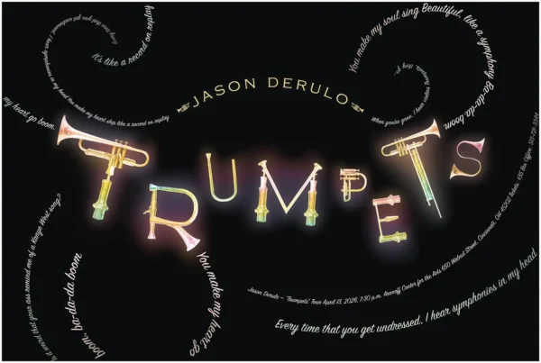
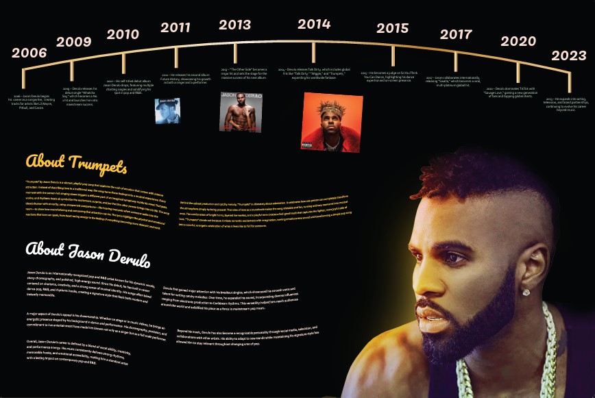
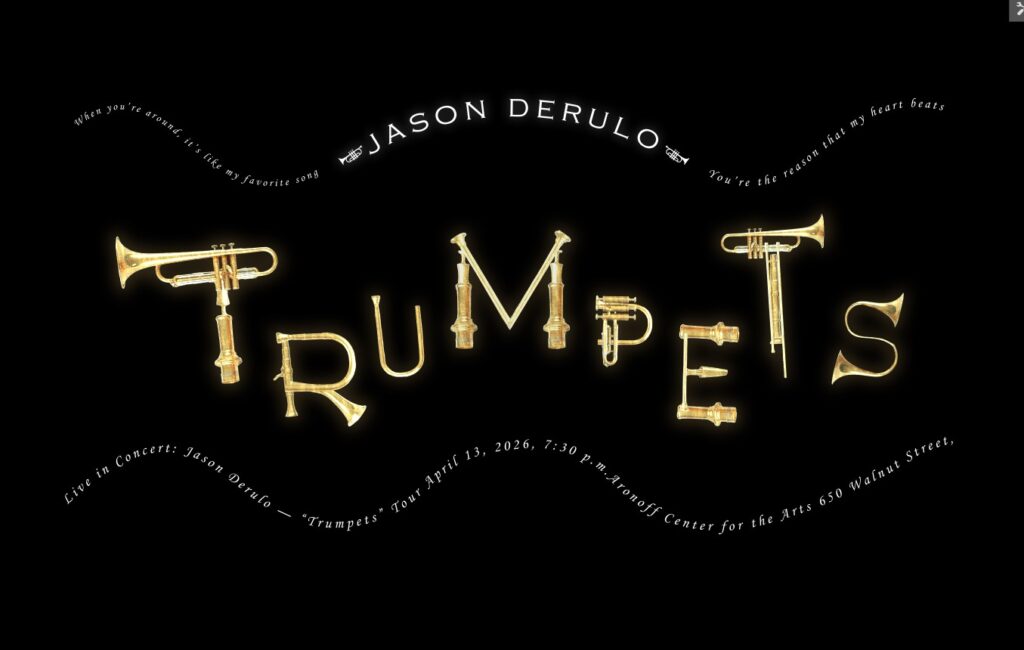
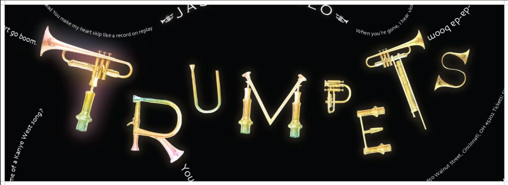
This project was a typography and poster design piece based on the song “Trumpets” by Jason Derulo. The goal was to translate the energy, rhythm, and sound of the song into a visual format while also creating a back side that provided information about the artist’s career.
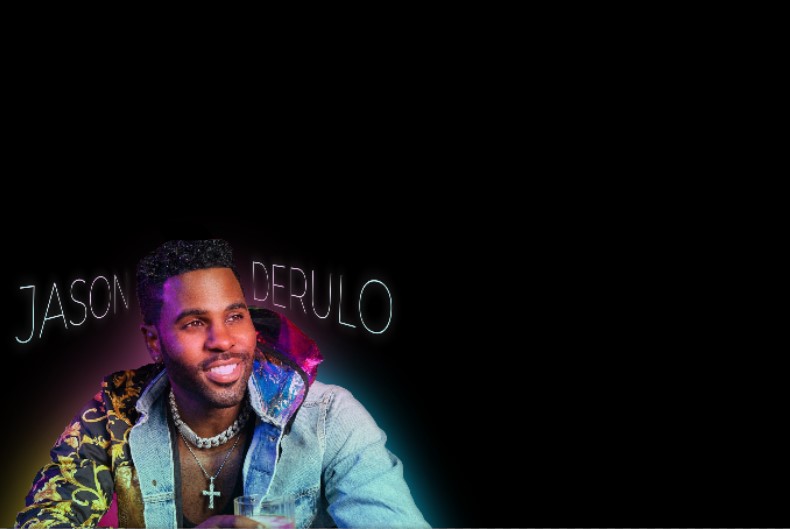
The final piece combines expressive typography, music-inspired imagery, and an infographic-style timeline. The front of the poster focuses on the feeling of the song, while the back gives viewers a deeper look into Jason Derulo’s career and musical progression.
Project Details
Role: Designer
Category: Typography, Poster Design, Music-Inspired Design
Tools: Adobe Illustrator, Adobe Photoshop, Generative AI
Deliverable: Front-and-back poster design
Focus: Typography, layout, rhythm, artist research, visual storytelling
Challenge
The challenge was to take a random song and turn it into a complete visual design. Since the song “Trumpets” has a loud, upbeat, and rhythmic feel, the design needed to reflect that energy without becoming messy or hard to follow.
Another challenge was balancing two different purposes within one project. The front of the poster needed to feel expressive and emotional, while the back needed to organize information clearly through a timeline and artist details.
Process
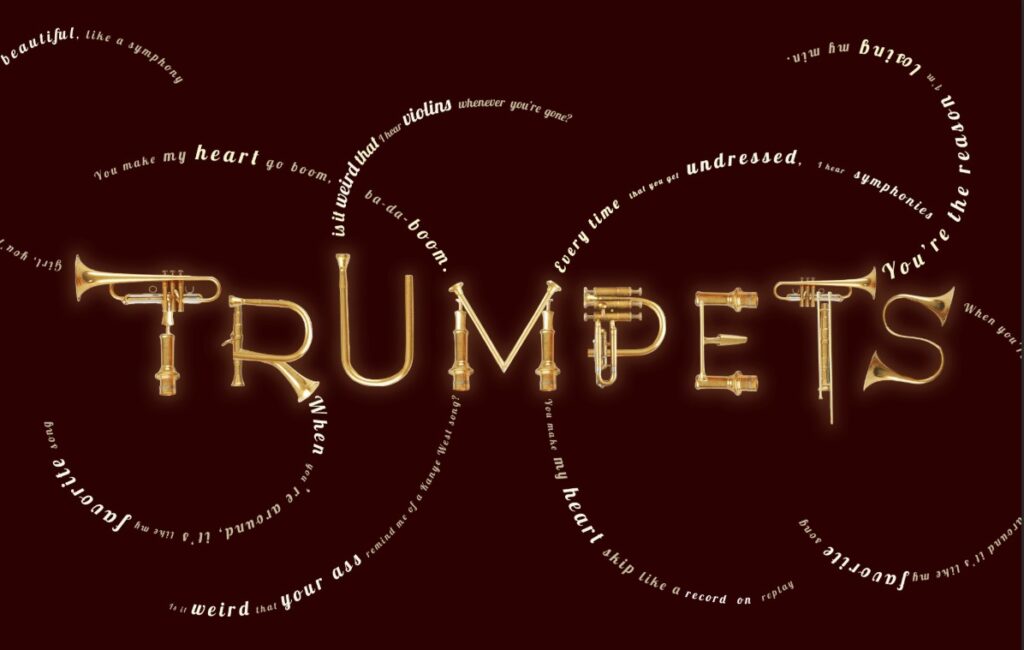
I started by listening to the song and identifying the main feelings I wanted the design to communicate: movement, sound, rhythm, and energy. From there, I explored different ways typography could move across the page, almost like the lyrics were following the sound of the music.
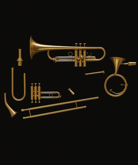
As part of the ideation process, I used generative AI to help brainstorm trumpet-inspired visual elements, possible layout directions, and iconography ideas. AI helped me quickly explore different visual possibilities, but I made the final design decisions myself by refining the strongest ideas, adjusting the composition, and building the final layout in Adobe Illustrator and Photoshop.
For the front side, I used curved lyric paths, glowing type, and a central trumpet visual to create a “sound-in-motion” feeling. I wanted the typography to feel like it was moving through the poster instead of sitting flat on the page.
For the back side, I created a more structured layout with an artist timeline, key album moments, and supporting text. This gave the project a balance between expressive design and organized information design.

Reflection
This project helped me understand how typography can create movement and emotion. I learned that type does not always have to be placed in a traditional layout it can bend, flow, and guide the viewer’s eye in a way that matches the feeling of the content.
I also learned how helpful AI can be during the early brainstorming stage. It gave me ideas for layout and trumpet visuals, but the final piece still required my own design judgment, editing, masking, typography choices, and composition work. This project taught me how to combine digital tools with personal creative direction to create a stronger final design.