
Overview
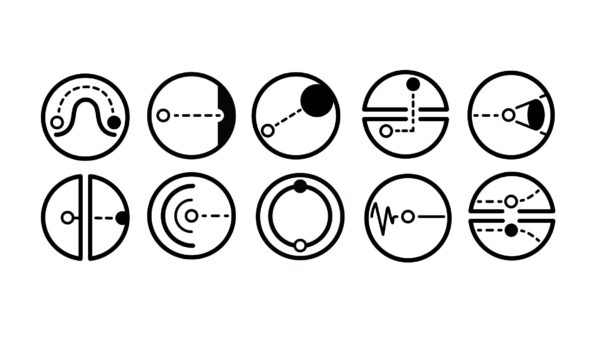
This project was created for a student-led exhibition and focused on designing a set of original pictograms. Each pictogram was based on an abstract word, which made the project more challenging because the concepts could not be represented too literally.
The final set includes ten icons that use simplified forms, consistent line weight, and repeated circular structures to create a unified visual system. The goal was to communicate meaning through design choices such as shape, balance, direction, spacing, and rhythm.
Role: Graphic Designer
Category: Icon Design, Visual Systems, Exhibition Design
Tools: Adobe Illustrator
Deliverable: Series of ten original pictograms
Focus: Symbol design, abstraction, consistency, line work, visual communication
Challenge
The challenge was to design a series of pictograms that could communicate abstract ideas in a simple and visually consistent way. Words like purpose, desire, peace, kindness, and mindset are not easy to show directly, so I had to find ways to represent each idea through symbols, movement, and composition.
Another challenge was making sure the icons worked as a set. Each pictogram needed to feel unique, but they also had to share the same visual language so the final group looked cohesive.
Process
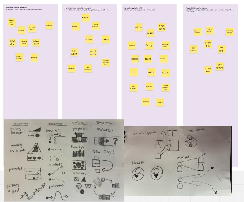
I started by studying each word and thinking about the feeling or action behind it instead of trying to illustrate it literally. For example, instead of showing “peace” with a predictable symbol, I explored how balance, space, and calm movement could represent that idea visually.
I developed the system around circular forms, clean black line work, and simple geometric shapes. This gave the pictograms a consistent foundation while still allowing each icon to communicate something different.
During the design process, I experimented with different arrangements of lines, dots, curves, and directional marks. I refined each pictogram by removing unnecessary details and focusing on the simplest form that still communicated the concept. The goal was to make every icon feel intentional, readable, and connected to the rest of the set.
Reflection
This project helped me understand how much meaning can be created with very simple forms. I learned that pictogram design is not just about making icons look clean it is about reducing an idea to its clearest visual expression.
I also learned the importance of consistency in a visual system. Small decisions like line weight, spacing, shape size, and repetition can make a group of icons feel polished and connected. This project challenged me to think more abstractly and make every design choice feel purposeful.