
Overview
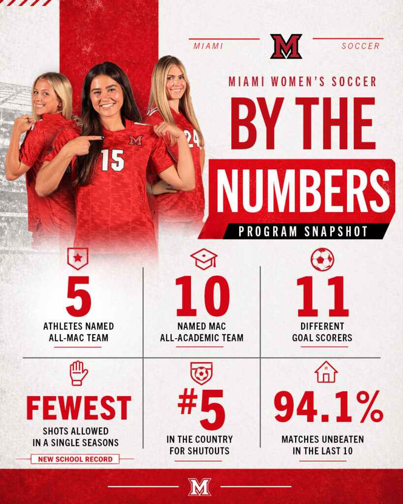
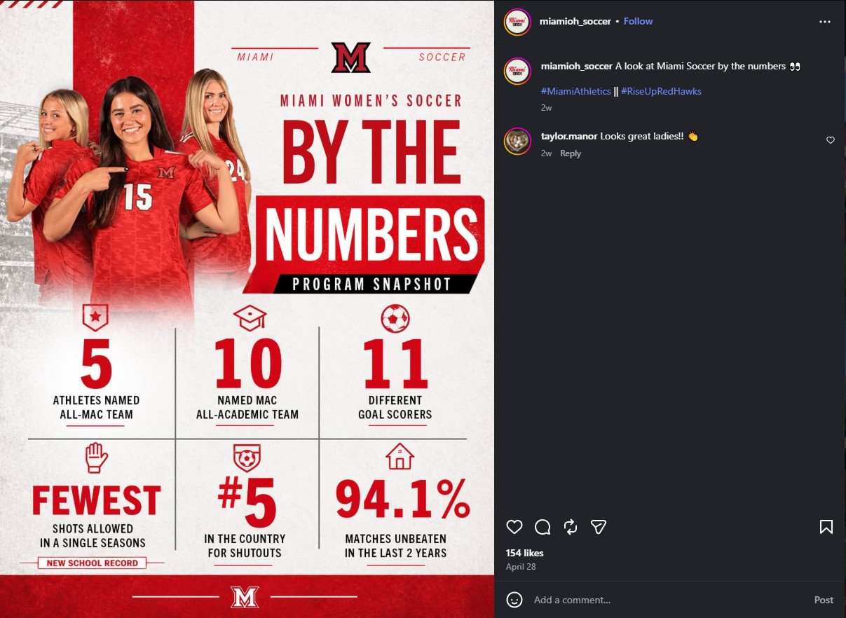
This project was a social media stat graphic created for Miami Women’s Soccer. The goal was to highlight key team accomplishments in a bold, organized, and brand-consistent format that could be quickly understood by viewers on social media.
The graphic was designed to feel energetic, professional, and connected to the Miami Athletics visual identity. Since the piece included multiple statistics, the main focus was creating a clear layout that helped the most important numbers stand out immediately.
Project Details
Role: Graphic Designer
Category: Sports Graphic Design, Social Media Design
Tools: Adobe Photoshop
Deliverable: Social media stat graphic
Focus: Typography, layout, hierarchy, brand consistency, visual storytelling
Challenge
The challenge was to present several team statistics in one graphic without making the design feel crowded or hard to read. Since the final piece was made for social media, it needed to catch attention quickly and communicate the information in only a few seconds.
The design also needed to match Miami Athletics branding while still feeling exciting and original. I had to balance clear information design with the energy expected from a sports graphic.
Process
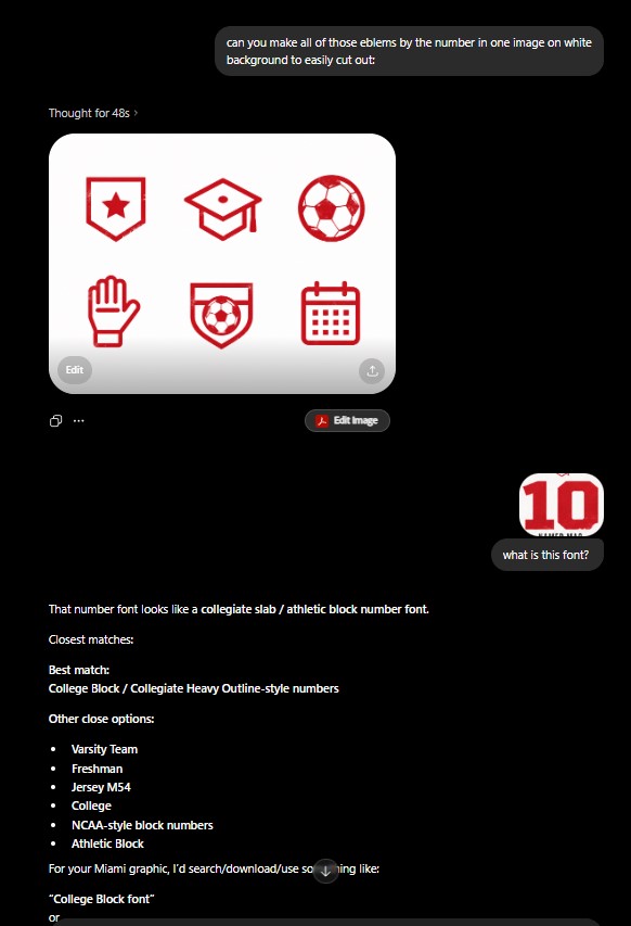
I started by identifying the most important elements of the design: the headline, player imagery, and key statistics. From there, I explored different layout directions and icon ideas to find the clearest way to organize the information.
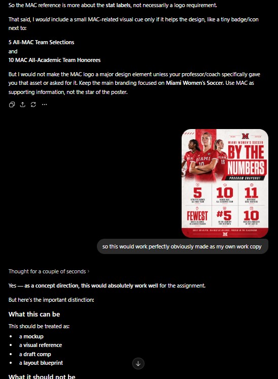
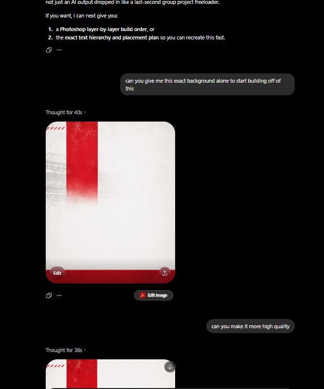
As part of my brainstorming process, I used AI as a creative support tool to generate layout inspiration, possible iconography directions, and ways to structure the data visually. I then refined those ideas myself by choosing what worked best for the Miami Athletics brand, adjusting the hierarchy, and building the final composition with a more polished sports design style.
I used Miami’s red, white, and black color palette to keep the piece consistent with the school’s brand. I also used bold typography and a structured layout to separate each statistic clearly. The player image was placed near the top of the graphic to create an immediate connection to the team and make the design feel more personal.
Throughout the process, I focused on spacing, alignment, and readability. Since social media graphics are often viewed quickly, every part of the design needed to have a clear purpose. The final layout came from combining AI-assisted ideation with my own design decisions, revisions, and brand-focused execution.
Reflection
This project helped me better understand how important hierarchy is when designing with multiple pieces of information. I learned that every number, icon, and text element needs to be placed intentionally so the viewer can understand the message quickly.
I also learned that sports graphics need to feel exciting, but they still need strong structure. The best design choice is not always adding more effects. Sometimes the stronger solution is simplifying the layout so the message lands faster.