
Overview
This project was an informative highway billboard design focused on distracted driving awareness. The goal was to create a public-safety message that could be understood quickly by drivers passing at high speed.
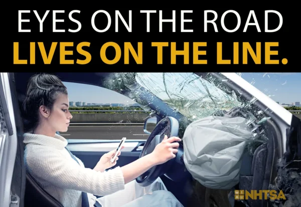
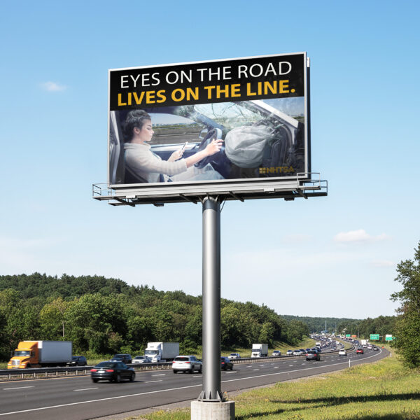
The final design uses a bold headline, dramatic imagery, and a realistic billboard mockup to communicate the danger of looking away from the road. Since billboards are only viewed for a few seconds, the design needed to be simple, readable, and emotionally direct.
Project Details
Role: Designer
Category: Billboard Design, Public Awareness Design
Tools: Adobe Photoshop
Deliverable: Highway billboard design and mockup
Focus: Message clarity, Photoshop compositing, visual impact, public-safety communication
Challenge
The challenge was to design a billboard that communicated the danger of distracted driving in a fast, clear, and memorable way. Because highway billboards are viewed quickly, the message could not rely on long explanations or small details.
The design needed to immediately show the consequence of distraction while still being easy to read from a distance. I had to balance emotional impact with simplicity so the billboard would feel serious without becoming visually overwhelming.
Process
I started by focusing on the main message I wanted drivers to remember: keeping your eyes on the road can save lives. From there, I developed the headline “Eyes on the Road, Lives on the Line” because it was short, direct, and connected clearly to the distracted driving theme.
I used Photoshop to build the final composition by combining several separate visual elements into one scene. This included the driver, phone, airbag, cracked windshield/glass effect, and supporting road imagery. I adjusted the lighting, shadows, scale, and placement of these elements so they would feel like they belonged together in the same visual environment.
I also tested the design as a billboard mockup to make sure the message worked in a real highway setting. Since the viewer would only have a few seconds to understand it, I kept the typography bold, the color contrast strong, and the layout simple.
Reflection
This project helped me understand how important simplicity is in billboard design. A billboard does not have time to explain it has to communicate almost instantly.
I learned how to make stronger decisions about hierarchy, contrast, and image selection. I also improved my Photoshop compositing skills by blending multiple images into one realistic final piece. This project showed me that effective design is not just about making something look polished; it is about making the message clear enough to be understood in the real world.